

Local Museum Website Redesign
BRIEF
The project focused on improving the museum’s digital presence by applying user-centered design principles. This included analyzing the existing website and studying the museum’s physical space better to translate the in-person experience into a cohesive digital interface. The process involved developing solutions from low to high-fidelity prototypes.
CHALLENGE
To create a responsive, intuitive landing page that enhances usability, effectively communicates the museum’s offerings, and bridges the gap between the physical and digital visitor experience.
ROLE
UX design, UI design, Graphic design, Research
PLATFORMS
IOS, Android, macOS, Microsoft Windows
DESIGN TOOLS
Figma
,
Part One: Museum Observation
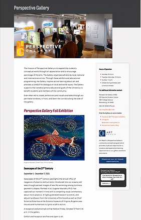
The first step was to select a local museum and evaluate its website experience. After reviewing several options, I chose the Perspective Gallery at Virginia Tech as the focus of my redesign. I then explored both its website and physical space to understand the user experience better. Based on these observations, I analyzed key aspects of usability, content, and overall engagement by answering the following questions:

01
What is working well throughout the site?
-
Everything is organized and clean
-
Not a lot of navigation is needed because most, if not all, of the information is on one landing page
03
Are there moments or objects in the physical environment that could be included or translated better on the website?
-
I feel that the artworks themselves could be of better quality and presented more effectively
-
Have separate sections or landing pages for each exhibition to create emphasis and lessen possible confusion
02
Is the physical space highlighted well on the website?
-
Not exactly (there is a single photo of the overall space, but there's no specific emphasis or focus on the space)
04
Could some elements live on the landing page versus being tucked away in another page or vice versa?
-
The current website has all the elements and information on a single long landing page, but I think separating specific information into different pages would also work and wouldn't take away from anything
05
What is lacking in terms of aesthetic, structure, and overall experience?
-
Not very immersive or interesting
-
A load of information on one page can be overwhelming
Part One: Museum Observation
The first step was to select a local museum and evaluate its website experience. After reviewing several options, I chose the Perspective Gallery at Virginia Tech as the focus of my redesign. I then explored both its website and physical space to understand the user experience better. Based on these observations, I analyzed key aspects of usability, content, and overall engagement by answering the following questions:
Part Two: Design Research
I then developed six “How Might We” questions to help guide the design direction and spark ideas for improving the user experience. To further inform my decisions, I analyzed three case studies featuring inspiring website designs.
How might we create separate sections for users so that they can browse through the website?
How might we incorporate more colors for users to give it more personality?
How might we break down the information for users so that they actually want to read it?
How might we make the website more visually engaging and enjoyable for users?
How might we make navigation easier for users so that they don't feel frustrated?
How might we create an ambience for users so that they feel immersed in the exhibition?
THREE CASES STUDIES
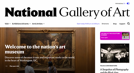
National Gallery of Art
-
Drop-down menu for easy navigation
-
Lots of animation to maintain engagement
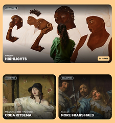
Frans Hals Museum

Rijksmuseum
-
Card design with round edges
-
Clean, yet effective
-
Center-alignment
-
Image as background
-
Museum name is boldly displayed
Part Three: Low-Fidelity Prototype Sketches
After researching other museum websites and defining a main “How Might We” question about making the website more visually engaging and immersive, I sketched two low-fidelity prototypes exploring potential layouts.


Part Four: Designing in Figma
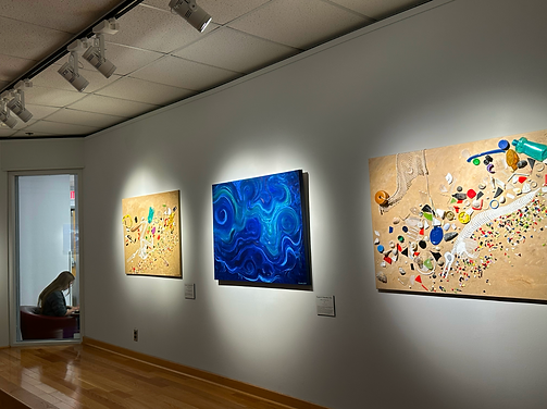
During my in-person visit to the Perspective Gallery at Virginia Tech, I noticed how ceiling spotlights were used to emphasize and enhance the artwork. Inspired by this, I photographed several pieces and adjusted the brightness on my phone while taking pictures to create the effect of a dark room, where the artwork is illuminated solely by the spotlights.
BEFORE
AFTER

I was really drawn to the photos' overall look and atmosphere and saw an opportunity to translate that aesthetic into a digital experience. Based on this concept, I designed the website in dark mode rather than the bright, white aesthetic commonly seen on museum websites. Drawing further inspiration from the gallery's lighting, I created a section where users can view current artworks with a spotlight effect that highlights the piece they are viewing.

I also added an “Upcoming Activities” section, which the current website does not prominently feature, even though it offers events and programs that could boost audience engagement. To make the website more engaging, I added an interactive element that, when hovered over, reveals a brief description, helping users quickly understand each event.


*Displays when hovered over

*Displays when hovered over
To maintain brand consistency and strengthen the website's overall identity, I incorporated elements from the gallery's logo, including its colors and shapes, into the "Visit Us" section. I added key details such as the gallery’s hours of operation, address, and the fact that admission is free with no tickets required, making it easier for users to access essential information without having to search the website.

Finally, I designed and animated a loading screen that introduces the Perspective Gallery’s logo, setting the website's tone and immediately immersing users in the gallery’s visual atmosphere.
Part Five: Before & After
A final overview of the redesigned interface, alongside a comparison with the current Perspective Gallery website.
BEFORE
AFTER

Addition of a navigation bar to minimize text overload
Introduced "dark mode" to enhance and differentiate the experience
More exhibition artworks to build trust & credibility
Spotlight effect to emphasize artwork and mimic the physical gallery
Clear visual cards for current events and programs
Improved info access with stronger logo integration
Part Six: Mockups
A collection of website mockups showcasing responsive designs across desktop, tablet, and mobile layouts.


Part Seven: Final Thoughts
Overall, I really enjoyed this project, which involved thorough research and thoughtful design decisions. I learned the importance and challenge of creating a responsive website across desktop, tablet, and mobile. Visiting the gallery in person also really shaped the redesign. Experiencing the space firsthand inspired elements like the spotlight effect on artworks, showing how physical context can directly inform digital design. In the future, I’d like to explore alternative layouts beyond the current center-aligned design, which I feel is not common on museums and gallery websites.